Whatever it is, the way you tell your story online can make all the difference.
 

CASE STUDY / IBOTTA

how people learn

the problem

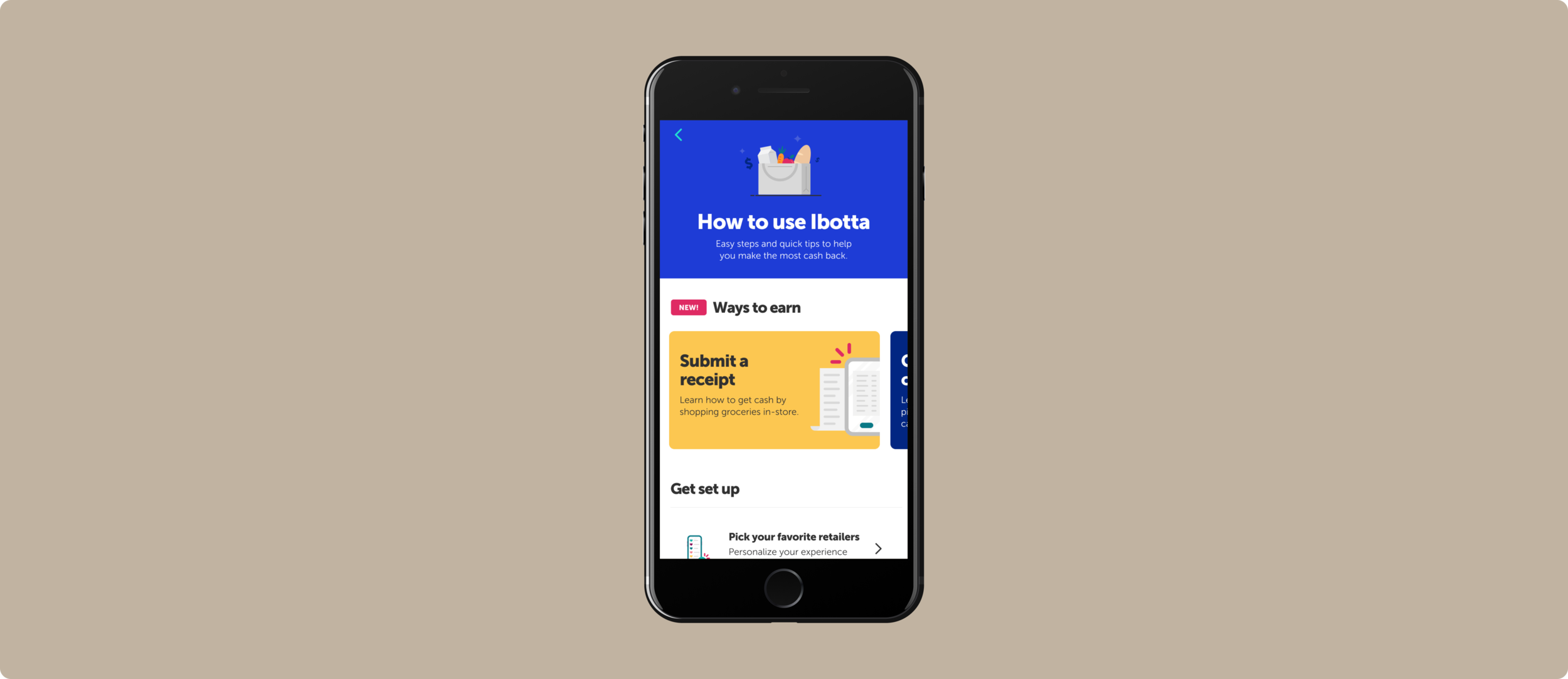
People who use Ibotta for the first time are really confused. Where do I begin? What does this app do? How does it work? So confused, in fact, that most of them don’t come back after poking around once or twice. Our objective was to educate and guide users on how to use the app and establish good user behaviors from their first experience.

The Ibotta app is robust and complex, giving people several different ways of earning cash back for shopping, so our hypothesis was that a little education would go a long way for the people who want to learn more, reduce overall user confusion and help people stick with Ibotta longer.

the logistics

  • Team: content designer (me), product designer, product manager, ux researcher

  • Timeline: 7 months

the spoilers

  • The homepage banner and learning center both moved the metric’s that’s hardest to budge at Ibotta: activation.


RESEARCH

what are the ways to learn about an app?


start with blank slates

Working with our product designer, we scoured apps of all industries for methods of learning. We organized them by learn-by-seeing (e.g. video), learn-by-doing (e.g. tutorial) and learn-by-reading (e.g. contextual tip) methods. Then turned them into white-labeled components, with generic copy that didn’t distract from their functionality, so they look like they could appear in any kind of app. We used these in a card sort with new and existing users.


card sort crucial insights

  • Preferred methods of learning vary by how experienced a user is with Ibotta. For example, new users want tutorials and checklists, while experienced users want lightweight tips and tricks.

  • Most users said they have a preference for learn-by-seeing and -reading, but showed a preference for learn-by-doing guidance.

  • Many users said a walkthrough of how to submit a receipt for cash would be helpful.

  • Users said they don’t want to be bombarded with educational pop-ups (who does).


SOLUTIONS & TESTING

so how do we solve for all ways users like to learn?


(New) problem

  • Users have different learning styles. They have different experience levels, and different gaps in Ibotta knowledge. Some of them want walkthroughs of basic Ibotta functions, none want in-your-face pop-ups.

  • Content design challenge: How can messaging be eye-catching, helpful AND concise, particularly on feature walkthroughs?

Hypotheses

  1. If we provide a central place that holds educational content, users are empowered to learn about Ibotta on their own, at their own pace, without being shown information they already know.

  2. If we provide a simple learn-by-doing walkthrough of submitting a receipt for cash—a core Ibotta function—new and newish users will understand the core benefit of Ibotta more quickly (getting cash back), and stick with the app longer.


let’s start with just 2 ways

  • Solution for hypothesis 1: A homepage banner that takes users to a “learning center” of sorts where they can find various ways of learning how to get cash with Ibotta (like the videos, checklists, FAQs, from our white-labeled components we researched with). It replaces the spot where we normally show ad products, it’s unobtrusive so users can explore it at their leisure and it has a personal message that welcomes them to the app. The concept of a learning center was discussed with users for feedback in usability testing, but no visuals were provided.

  • Solution for hypothesis 2: A slide-up component also on the home page that encourages users to try out submitting a receipt for cash (again, a core function of the app) by doing it for real—with a tantalizing $5 opportunity. A full learn-by-doing walkthrough was designed for this task and is what we got most of our feedback on during testing.


usability testing crucial insights

  • Users expect the app to provide them with clear opportunities for them to choose the time and place for engaging with a learning module. The homepage banner nailed this, the slide-up chip did not.

  • The personalized message on the homepage banner did combat banner blindness (score!) but still most didn’t want to engage with it (shoot).

  • All users noticed and most engaged with the slide-up chip.

  • New and non-users wanted more explanation for each step on the “How to submit a receipt” page. Interesting! I thought it was already too much copy.

  • New and non-users were confused by the words “offers” and “list,” which makes sense because these are Ibotta jargon.


MANY MONTHS LATER

ship it

We had our insights, and it was easy enough to iterate based off user feedback—but what about technical constraints? And a learning center seemed like a good, clear solution—but what would that even look like? And also, technical constraints. For a few months we stayed here, in the messy, non-linear part of writing and designing, collecting feedback, iterating, more usability testing and seeing what was technically feasible, for about 6 or 7 rounds.

In the end, what we handed off to devs was an extra-simplified version of what we tested with, but also a fleshed-out learning center.


shipped: homepage banner

Ultimately, we merged the previous version of the homepage banner with the slide-up chip for a welcome message that doubles as optional learning.

  • Its message is action-driven (cutting right to the reason users are here: to get cash), while being friendly.

  • It starts to establish a mental model that there are several ways to earn cash with this app, and that submitting receipts is one of them.

  • It gives users the chance to learn more on their own—and even if they don’t engage with it but at least read the message, they already know more about the app that users did pre-banner times.

  • The “Submit a receipt” steps are still concise, but add more information that new and non-users said they wanted.


shipped: the learning center

  • Borrowing from the UX and success of the homepage banner (the learning center was released after the homepage banner, so we could learn from a/b testing within the app), we created similar learning modules for the other ways to get cash besides submitting a receipt.

  • The step-by-step screens used the same style and formatting as the “How to submit a receipt” screen previously tested, using concise but descriptive copy. Plus a CTA at the bottom for users to try it themselves.

  • The similar styles and visuals were intentional. They all feel part of the same learning experience. Not to mention, it’s easier on the devs to reuse the same styles / components.

  • NOTE: In the interest of not naming things unnecessarily and making more terms our users have to memorize, “learning center” is not user-facing. We just call it what it is—”How to use Ibotta.” The UX does the rest of the explaining for us.


the result? we moved our hardest metric

The homepage banner and learning center both moved the metric’s that’s hardest to budge at Ibotta: activation.

Homepage banner

  • 7-day activation increased by 0.5% (a small number, but translates to over 1.5 million dollars in profit).

  • Retention rate increased by 0.5%

Learning center

  • 7-day activation increased by 0.4%

  • Retention rate increased by 0.22%

Yes, this project took forever and went through a million billion iterations (many more than were shown here), but it resulted in a huge win for us, and more importantly, our users. With activation and retention up, we take that to mean people are more engaged, and for longer, because more of them understand what the heck to do with the app—and see the benefits more quickly (aka, making that bread).